Inweb · E-commerce · 2022–2023
People browsed idea.uz but didn't buy.
The redesign put installments first.
idea is a chain of electronics and home appliance stores in Uzbekistan, and buying in installments is at the core of its offer. As the only product designer at Inweb, the agency that builds and runs idea.uz, I redesigned the online store end to end. It went live in October 2022 and still runs on that structure in 2026.
Context
An electronics retailer
whose offer is built on installments.
idea sells phones, laptops, TVs and home appliances in its own stores and online. Its main promise is buying in installments with no down payment, so every product shows a monthly payment next to its price.
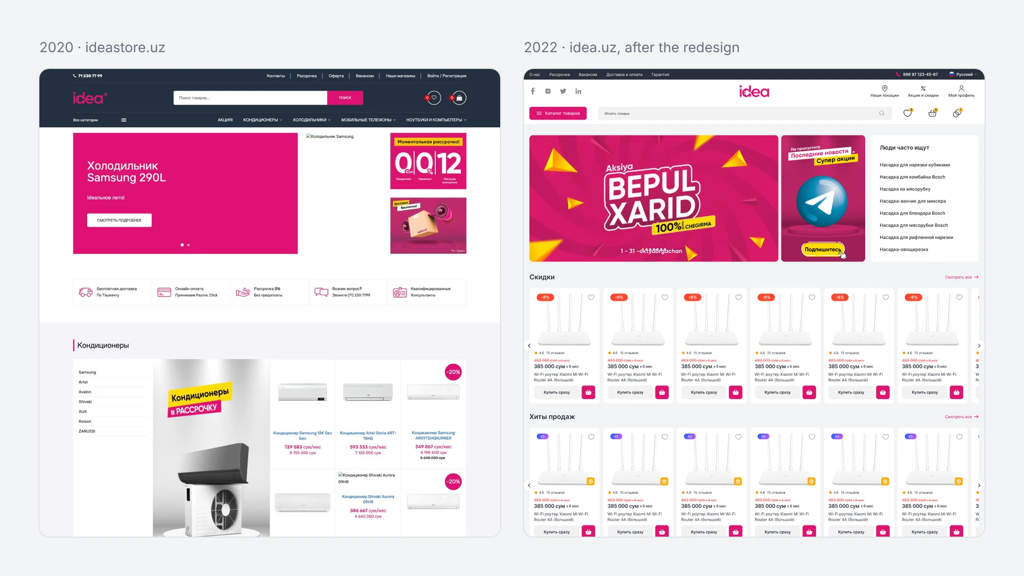
In 2020 the online store ran on a separate domain, ideastore.uz, while idea.uz showed a "site under construction" page. In 2021 the store moved to idea.uz. I worked on it at Inweb in 2022–2023 as the only product designer, and besides the store I designed promo sites and campaign pages for idea.
Problem
The old store looked dated and generic,
and conversion was low.
idea's goal was simple: more orders, and more of them in installments. The store we started from worked against it. Every category on the homepage was the same block of brands, a banner and six products. The menu showed four categories, product names were default blue links, and cards showed a monthly price without saying for how many months.
Research
No access to buyers.
The marketing team stood in for them.
I couldn't talk to idea's customers directly. idea's marketing team acted as proxy users throughout the project. It was a real limit, and I come back to it at the end.
Approach
Installments became part of every step,
from the card to checkout.
The redesign covered the whole path: 60 screens for desktop and mobile web, from the homepage and the catalog to checkout, order tracking and the account, all built on one set of components.
Monthly payment with its term
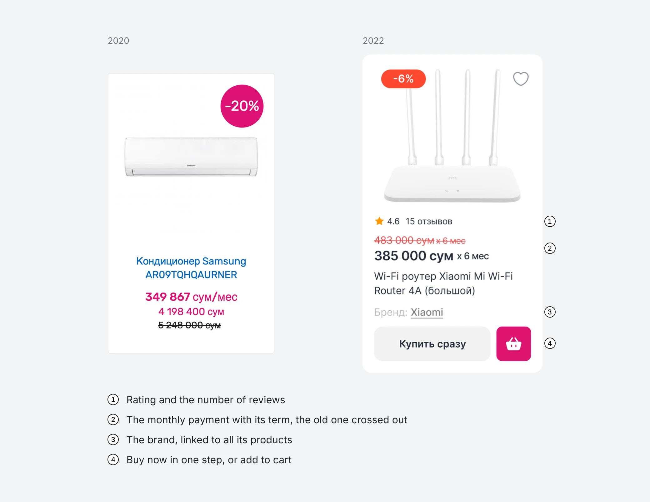
Cards show the monthly payment and for how many months, with the old price and the discount above it.
Term picker on the product page
The buyer picks the term, sees the monthly amount and buys in installments from the same box.
Installment request in checkout
Personal details, passport and card go into one order, so the request is sent online.
Instant purchase by phone
Buyers who would rather talk leave a name and a phone number, or call the store themselves.
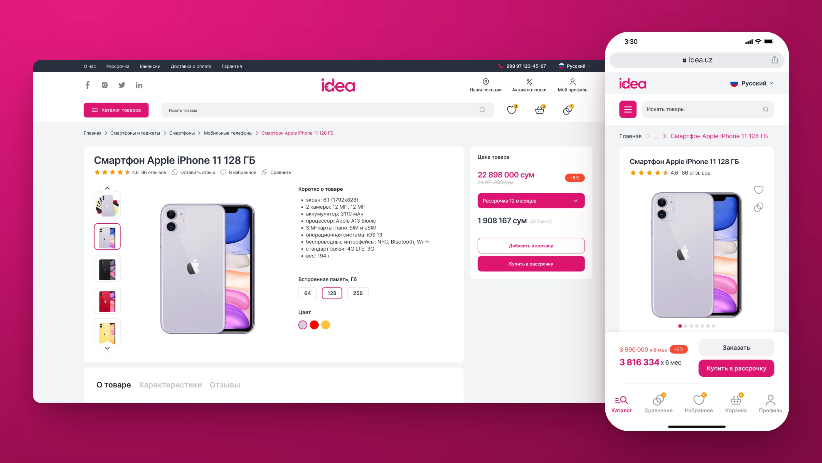
Product page
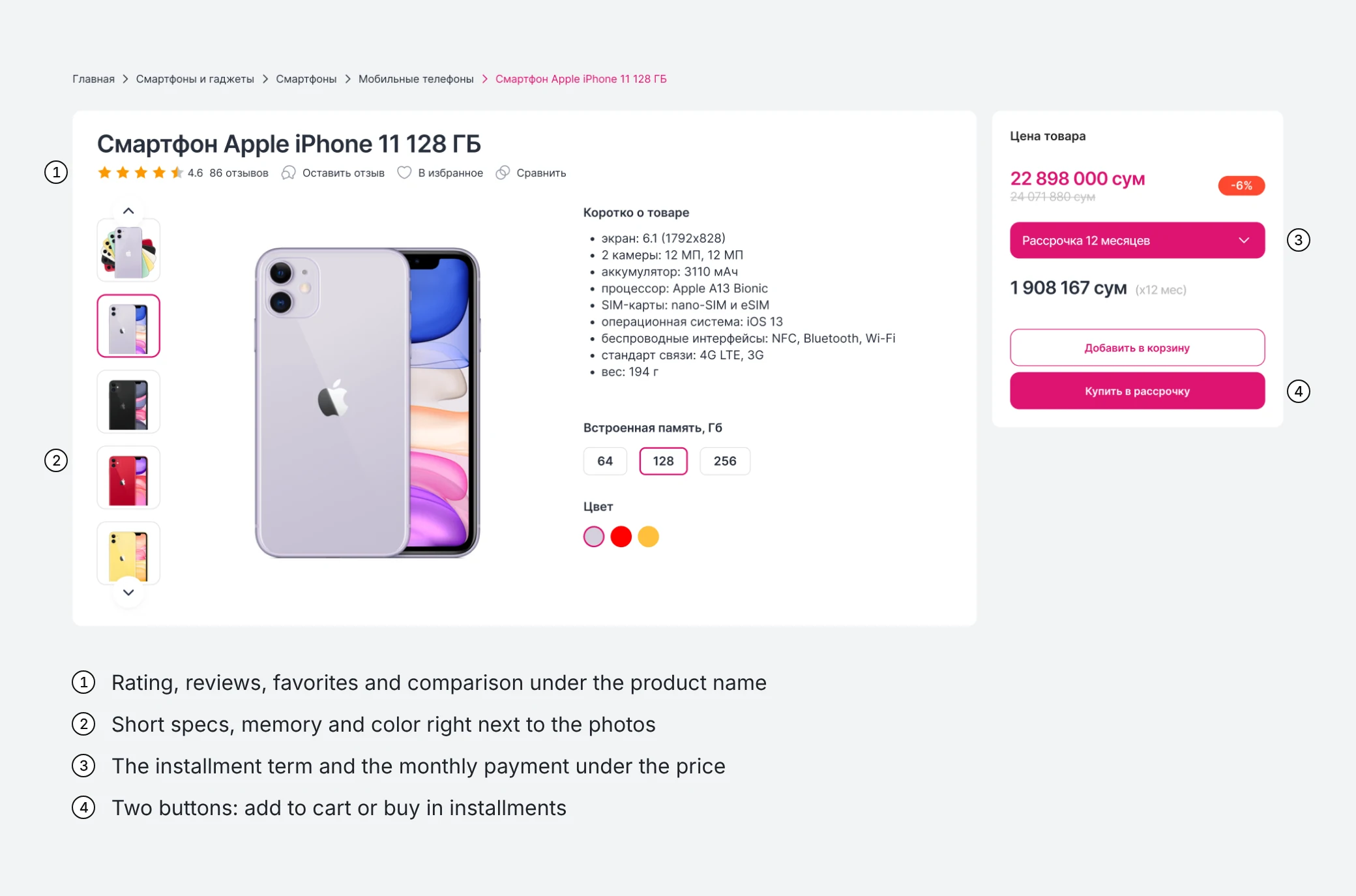
The product page puts choosing the model
next to choosing how to pay.
The left side is about the product: photos, the rating and reviews, short specs, memory and color. The price box on the right is about paying: the price and the discount, the installment term, the monthly payment, and two buttons, "Add to cart" and "Buy in installments". Favorites and comparison sit right under the name, for buyers who aren't ready to decide yet.
Catalog
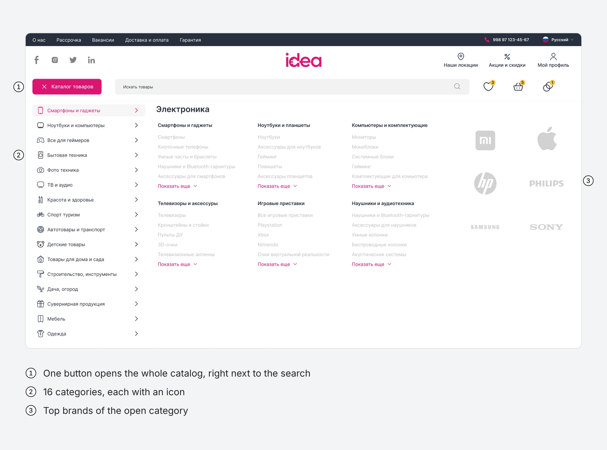
One button opens the whole catalog,
all 16 categories and their brands.
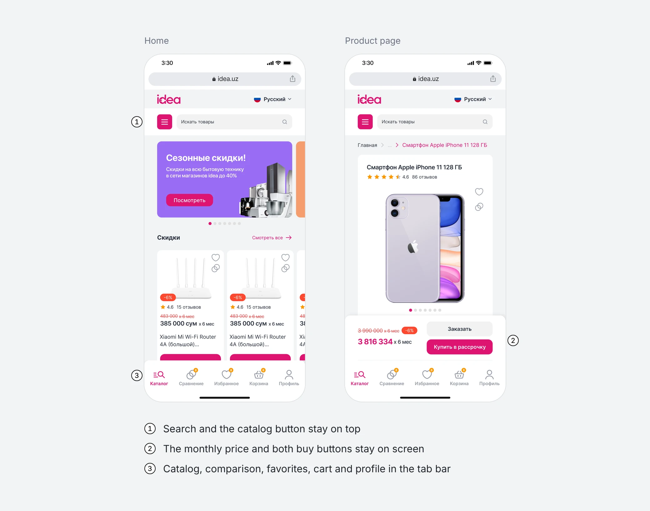
The old menu showed four categories. The new header puts a "Catalog" button next to the search, and the menu opens every category with its subcategories and top brands. The homepage lists what people often search for right next to the main banner.
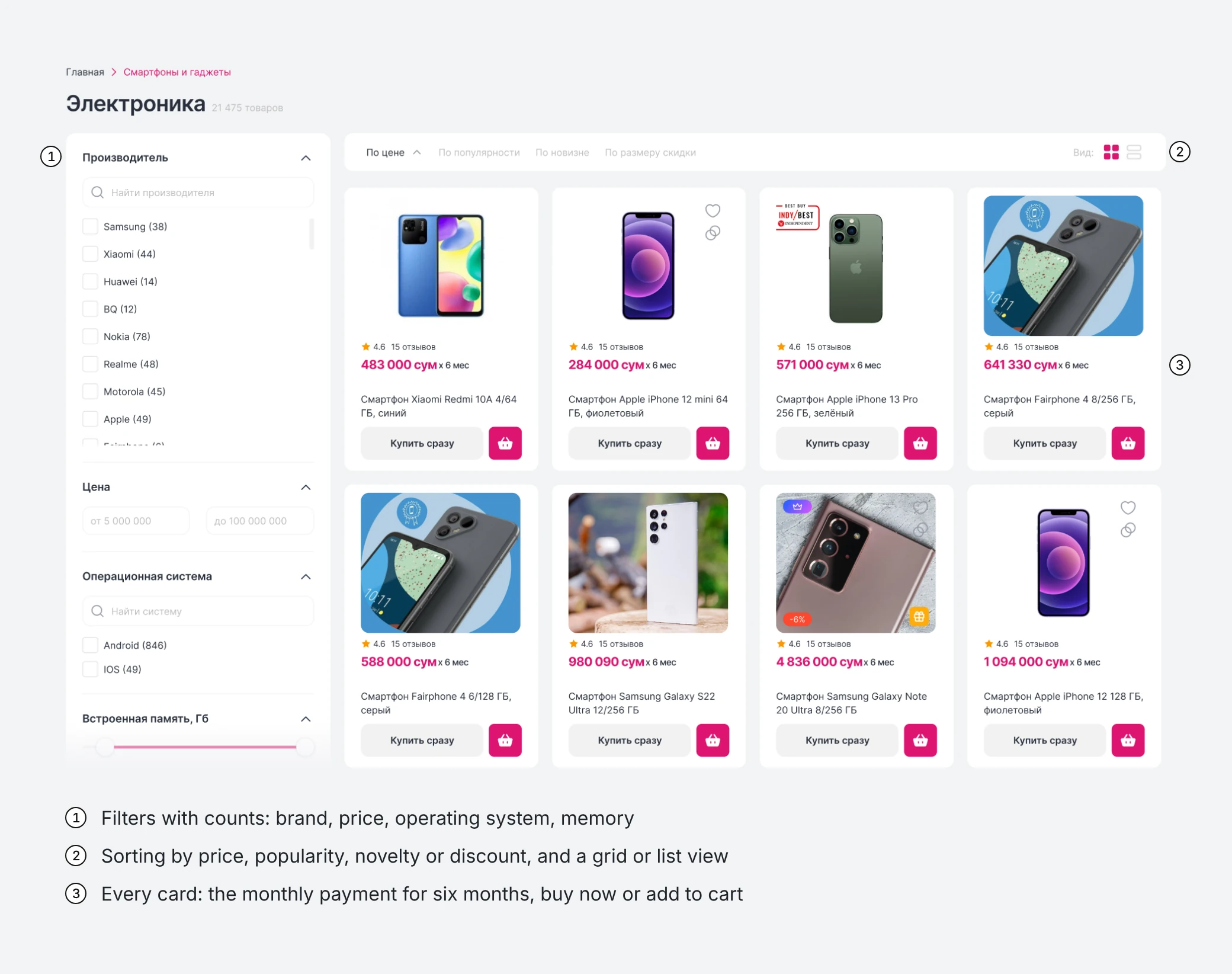
Category pages get filters with counts, sorting, and a grid or list view. Every card in the list shows the monthly payment and two ways to buy: right away, or through the cart.
Checkout
Checkout takes the installment request,
or just a phone number for a call back.
The installment details go into the same order: personal details first, then the passport and the card. For people who don't want to fill in a form, the banner on top asks only for a name and a phone number, and an operator calls back.
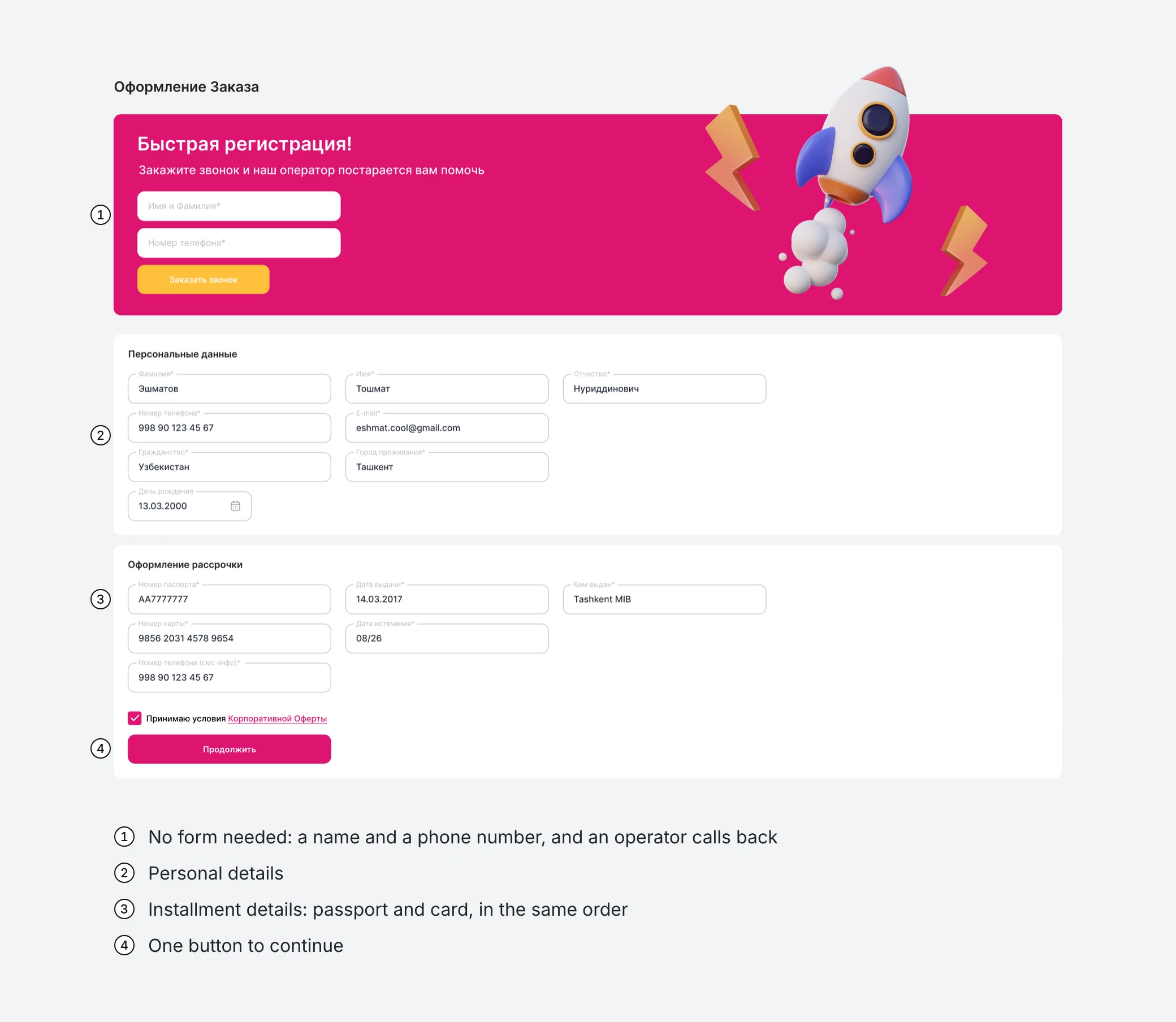
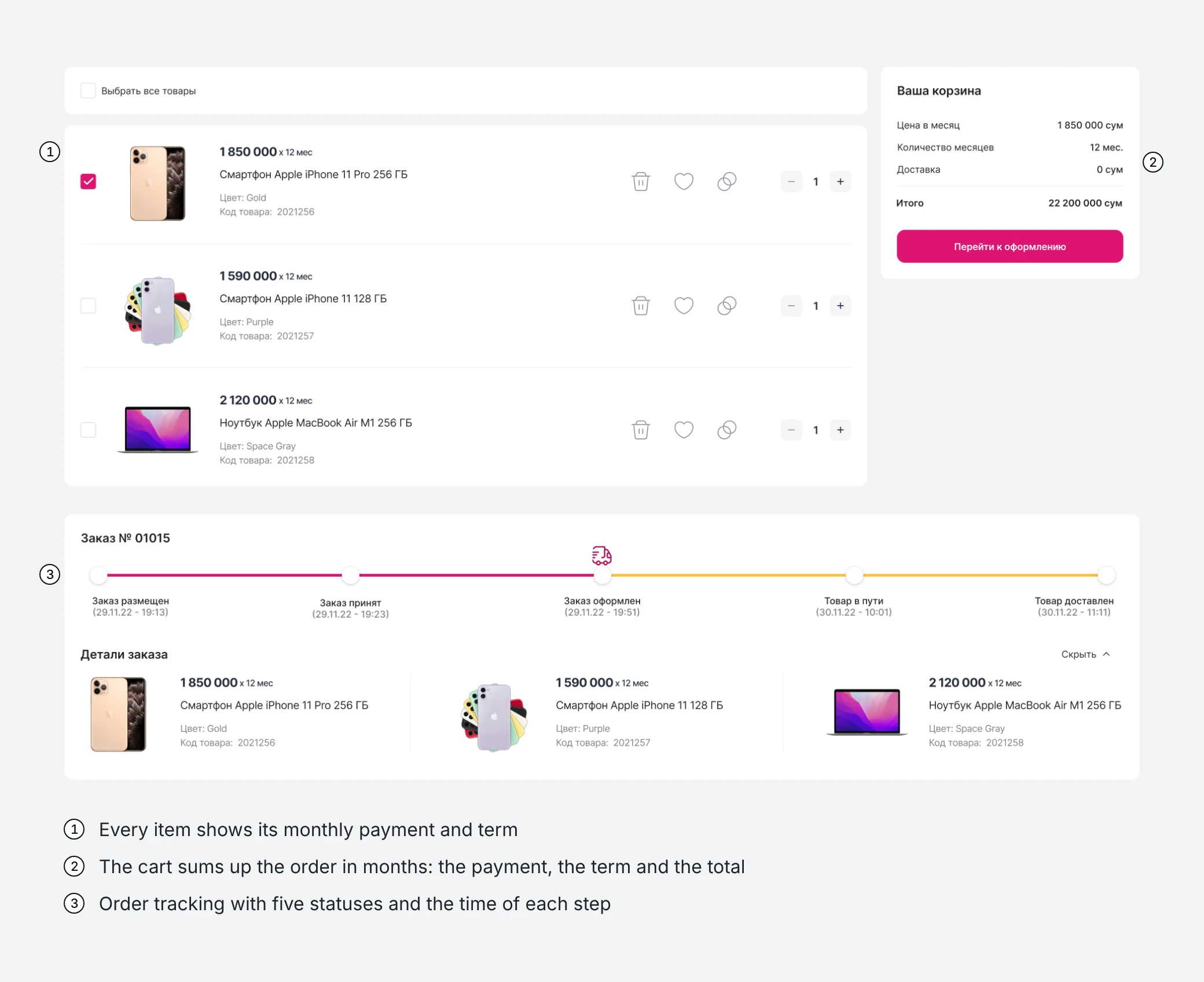
The steps around checkout count in months too. The cart sums up the order as a monthly payment, a number of months and a total. Order tracking shows five statuses with their times and keeps each item's monthly payment.
Mobile
On a phone, the monthly price
and the buy buttons stay on screen.
Mobile web uses the same components. The product page keeps the monthly price and "Buy in installments" at the bottom of the screen, above a tab bar with the catalog, comparison, favorites, cart and profile.
Iteration
Choosing how to pay took two controls.
The rework made it one.
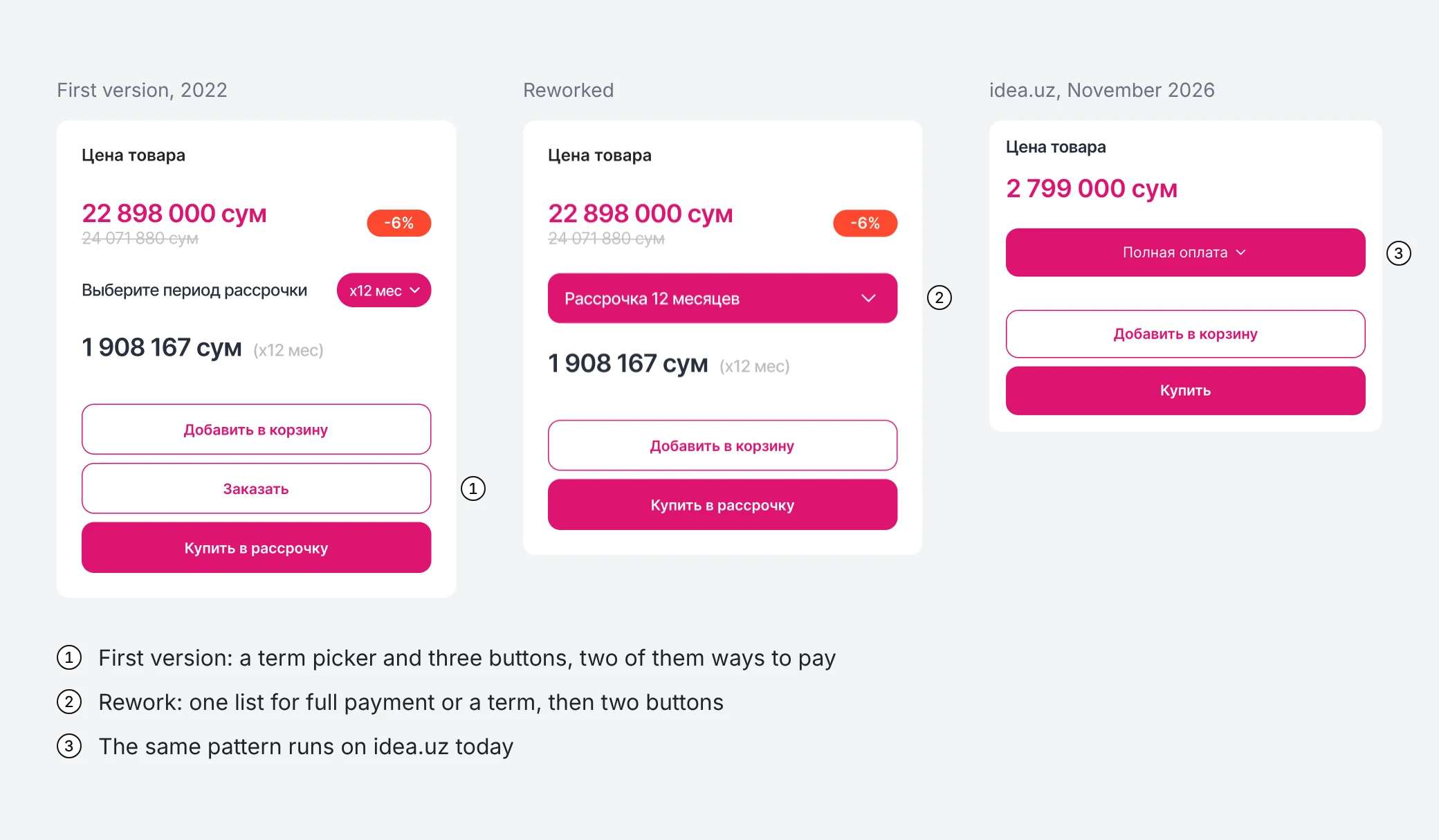
The first product page had a term picker and three buttons: add to cart, order, and buy in installments. How to pay was split between the picker and the buttons.
I reworked it into one choice: full payment or an installment term, in a single list. The box then shows the monthly amount when it applies and only two buttons, and the main one follows the choice. This version runs on idea.uz today.
Results
About 2 million users,
and the same structure four years later.
The new idea.uz went live in October 2022. According to idea, about 2 million people use it. In November 2026 the site still runs on the structure of the redesign: the catalog button next to the logo, product cards with the monthly payment, the brand and "Buy now", and the product page with the reworked price box. The header and some details have changed since, as they do in a living product.
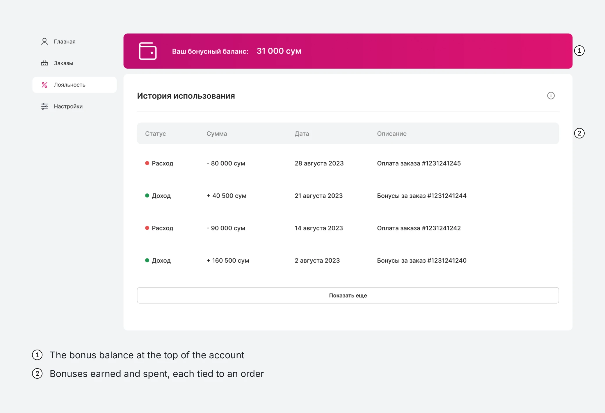
After the launch I kept working on the store with Inweb's developers, and in 2023 I designed a loyalty program with a bonus balance and its history.
Lessons
Proxy users are not users.
One decision deserves one control.
The marketing team knew the offer better than anyone, but proxy users can't show where real buyers hesitate. The first price box is an example: it split one decision between a picker and three buttons, and it took a rework to give it one control. Next time I'd put the key flows in front of a handful of real buyers before handoff, even without a research budget.
Behance
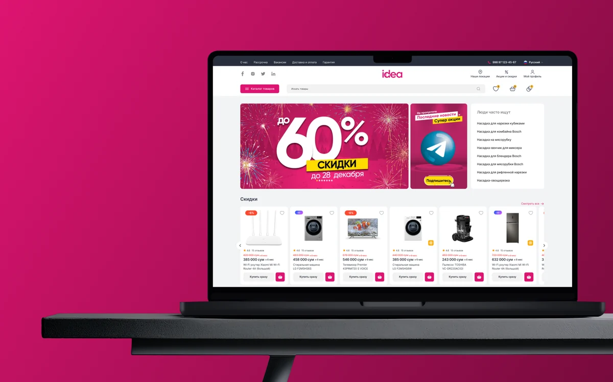
More screens, in one long presentation
The same redesign on Behance, laid out as a visual story.
Let's talk
Want the story behind the decisions?
On a quick call I'll walk you through the flows, the trade-offs and what I'd change today.
Or message me on Telegram ↗Thanks, your request is in. I'll reply within a day with a few time slots.
More work
All work